5 Ways Effective Web Designs That "Talk" Directly To Your Customer..
Effective website design is what determines the success or failure of a website. A good web design is instrumental in enhancing your sales. While the quality of the products and/or services, prices etc are a given, what we are talking about here is how subtle and not so subtle changes in web design can make a significant impact on sales.
Effective web design is that which enables the visitor to fulfill this goal (that of buying your product/ service) easily and in the least number of steps. In other words, effective web design makes it easier for the visitor to perform a particular action you want him to. This need not always be buying. It could include signing up for something, downloading an ebook, subscribing or sharing with friends etc.
Five Effective Website Design Techniques That Help Increase Sales
1) Put Forth the Benefits to the Visitors/Customers
The basic rules of selling remain the same whether you are online or in a physical store. The customers want to know the benefits they will get on buying your product or service. Check this website https://www.scorebig.com/. The website’s home page talks about how members can save up to 60% on sports and concerts tickets. This is immediately followed by an option asking members to sign in or sign up (for new members). It is a simple and direct call for action based on something that will immensely benefit the customer. There is no complicated content for the visitor to read. If he wants up to 60% discount on concert tickets, he must sign up. When the message is as compelling as that, chances are, the visitor will sign up. And the fact that the sign up option is right there helps significantly.
2) Do not Confuse the Visitors
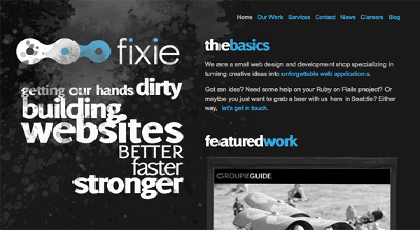
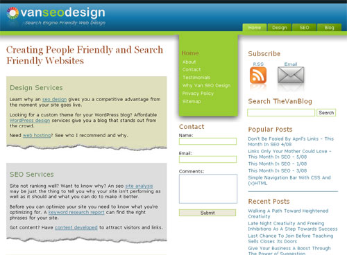
Keep your website design simple and uncluttered. Do not have reams of text. Online visitors do not read through in detail. They will merely skim. And when they are looking for a particular product or service, an effective website design that gives them a quick, but impressive overview of what you do will prompt them to investigate further and increase the chances of conversion.
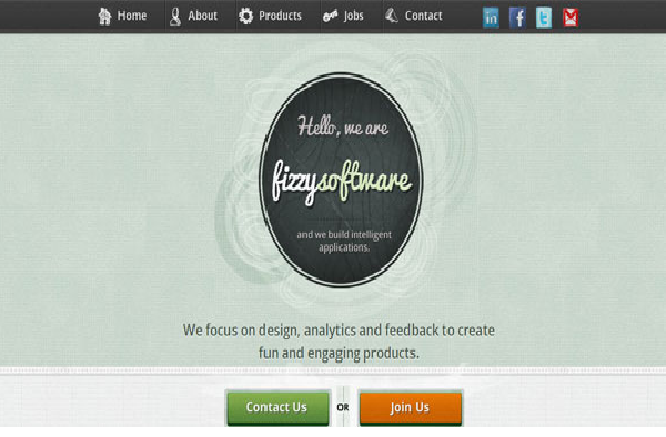
This is an effective web design that conveys what the company does in simple and clear manner. Find below another example
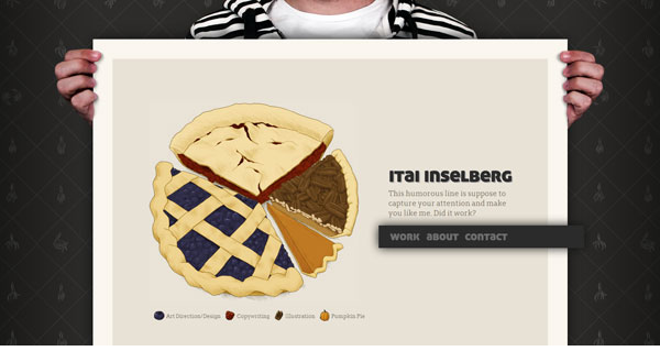
Check the website http://itaiinselberg.com/ to find that this minimalist theme is present throughout.
3) Focus on Aesthetic Appeal of the Website
There are certain principles of website design which make a better connect with the human eye. Keeping these in mind ensures that your website will catch the eye of the visitor better, increasing chances of conversion. These principles include:
Contrast
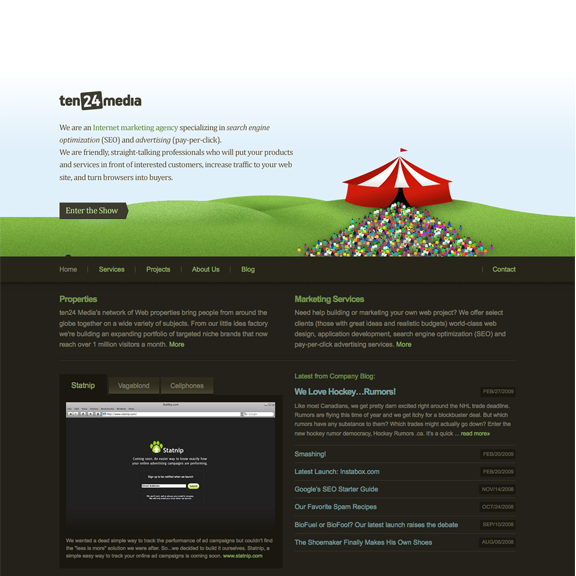
Contrast in any element helps draw attention, as against a website design that is uniform all across. You can achieve contrast either by using images of different size or different colors or varying fonts and /or font sizes. Let us consider some examples.
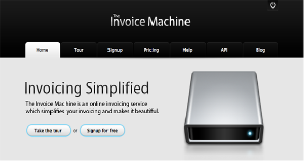
Attention is drawn to the product (invoice machine) by keeping the image large. Also the blue dot on the machine draws attention because rest of the design is monochromatic.
Contrast achieved through colors
The font variation in the tagline creates an interesting contrast, as does the use of dual colors.
Repetition
Though this may appear in ‘contrast’ with the above principle, using repetition in the header and footer is also effective in creating a positive impact. An example:
The use of the ‘grass’ theme in the header and footer creates a pleasing look.
Alignment
The human eye always strains to find alignment, so websites effectively aligned make a better impression. Websites designed on a grid framework have good alignment. For instance
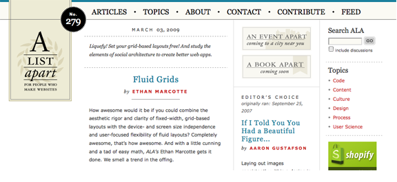
A visually obvious grid with well defined columns
The grid design is particularly recommended if you have a lot of content to display. The grid enables you to break up the matter into the well defined columns. Studies show really wide columns significantly reduce readability, as eyes get tired.
4) Help the Customers Buy
The purpose of your e-commerce website may be to sell products to customers. But make sure your ecommerce website design helps the customer buy. This requires focus on various aspects like ease of navigation to view all products and product categories and prominent search boxes so that customers can easily locate the products they are looking for. Some examples of navigational menu design:

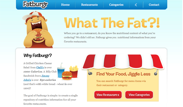
The website has vertical navigation menu on the left side. Also the use of red for ‘sale’ attracts attention towards products on sale.
You can also use a horizontal product navigation menu. For instance
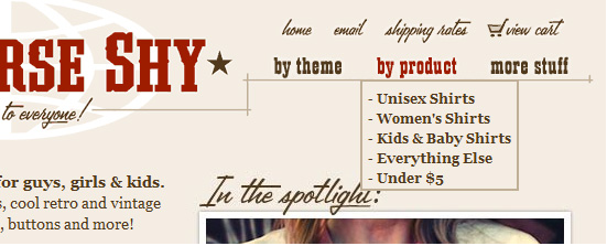
The website lets the customers browse by products or by theme as per their preference or requirement
Another example
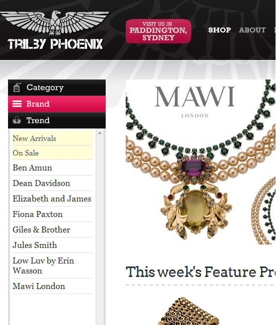
With a vertical left navigation menu, customers can browse by category, brand or trend. Each sub menu reveals a drop down menu.
Some websites with innovative and optimal placement of search boxes:
The unique shape of search box attracts attention, making it easier for customers to find it.
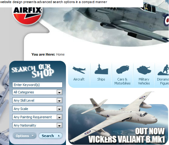
The website design presents advanced search options in a compact manner.
5) Focus on the Convenience of the Visitor
Keep in mind that if the visitor finds it too cumbersome to go through various processes on your website, he will just as easily move to another one. Make sure your contact details are prominently displayed. In case you are getting the visitor to fill up a form, keep the form fields minimum. Do not ask for more information than is strictly necessary.
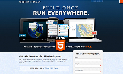
The website uses powerful imagery to convey what it does effectively. Note that copy is minimal. The telephone number is highlighted. And the form fields in the contact form are just 3.
Make sure your content is in a logical flow, the end of which is a natural progression on part of the visitor to ‘buy the product’ or ‘download the ebook’ or ‘sign up for membership’ or ‘like’ or ‘retweet’ your message. This does not mean you spin long yarns. Keep the content precise and to the point, while engaging the visitor.
Note that every word in the copy on the left hand side makes a strong case as to how the visitor’s business will be helped, if he clicks on the hyperlink. There are no empty words in the text.
Finally, minimize the number of steps for the ‘call for action’. 2- 3 steps are best. Anything more than this is too much.
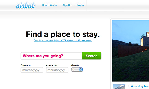
The customer gets to book a place in just 2-3 clicks. That’s Ideal.
In Conclusion
Website design is an important element in driving sales of your products and services. Even if you are not really selling anything online, a good website design helps increase conversion rates as people spend more time on a well designed and convenient website. Though the actual elements of effective website design differ, the underlying principle is to make things more convenient and easier for the visitor in a bid to convert him into a customer.
The website design techniques that I have discussed here are effective, no doubt, but by no means the only effective techniques. There are many others. Perhaps, you have come across some terrific website design elements that impressed you. Or perhaps you have designed effective websites yourself incorporating certain other elements and techniques. Why don’t you share them with us? Or may be you have used one of the techniques that I have discussed. I would love to hear how it worked for you.
I would like to leave you with these links that lead to some of the most effective website designs I have seen in recent times. Do let me know if you agree (or disagree).
http://www.seobook.com/ (Effective use of contrast colors – blue and green)
http://wakeinteractive.com/ (Clean and clear design)
http://www.famouscookies.com/default.aspx (Gets straight to the point)