
7 Common Mistakes People Make in Form Building
 One of the most important activities that any Internet marketer needs to undertake is building forms. After all, you can’t build an e-mail list without a form, even if it’s just a request for an e-mail address and a name. It’s also possible to build much more complicated forms in order to capture additional information. However, you need to keep some basic facts in mind in order to ensure that your forms are crafted appropriately.
Form Abandonment
One of the reasons that form design is so important is that many of us tend to suffer from form abandonment issues. People leave the forms unfilled because they get frustrated and they just walk away thinking that there is no point. Even when people do fill out the forms, often they get filled out incorrectly if you have done a bad job on designing them. Here are seven things to do differently:
Colored Backgrounds
I don’t see this too often so it’s not the most common thing but it is godawful annoying if you ask me. The vast, vast majority of web forms have a white background and the text you type is in black. Occasionally, they’ll change things up with a cream colored background but that’s about it. Ever wonder why forms tend to stick with the black and white?
The answer is simple – the colors will make it much more difficult for your customers to see what it is they are actually writing on your form. Just keep a basic white background with black fonts for filling them out. The color can work elsewhere but forms don’t need to be cute. They need to be functional. Here is a perfect example of a form gone bad: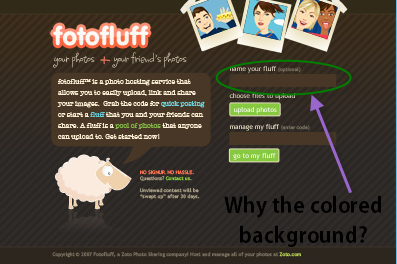
As you can see, for some reason, the background is brown. Try typing in black text on that brown background and you will end up with a mess which is hard to read, leading people to abandon your forms. Seriously people – there are times when being creative is just not a good thing and this is definitely one of those times.
Houston, We Have a Problem
This is actually a twofold problem and may be something you need to address with your programmer. Either that or just get a different service for filling out forms. First of all, when you have a form which is rather complicated, often people will program it to reject the content if the form is not properly filled out. This can be useful especially when you have situations such as improperly formatted e-mail addresses and phone numbers which are actually a series of letters and symbols.
A good idea when implementing forms though is to actually have the system catch the problem as people are filling in the forms. More and more web forms are designed to do this – they detect what people are entering and immediately warn people if it’s not a valid e-mail address or phone number or whatever.
If you don’t use this approach, at the very least, it is important to make clear what the problem is when the form shows up again. All too often I see the form bounce back without any explanation. Sometimes there is a slight color gradient which is meant to indicate a problem field but it’s often hard to tell. The best thing is to ensure that you have text telling people next to each item that it’s a problem.
It is also vitally important to warn people ahead of time if the password they chose is not going to fit with your parameters (more on passwords in a moment). Nothing is more annoying than filling in a password and then having to redo it.
Well scratch that – there is one thing more annoying than that. If you have one of those forms which automatically resets every time it rejects the content, please join the year 2013. You know the kind of form I’m talking about – you fill in around 30 fields on the form, click submit and it says your passwords don’t match. It takes you back…to a blank form so you can fill it all in over again.
Please for the love of all that’s holy ensure that your forms are designed to avoid this problem. Ideally, you should have forms which warn people as they type. If not, at the very least, keep all the rest of the information so all they need to do is fix the one issue.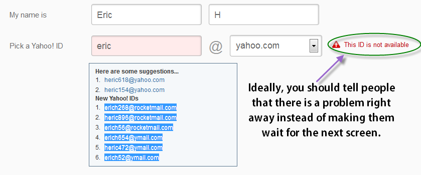
Don’t Be a Password Nanny
I know – websites get hacked constantly and people’s information needs to be secure. I get it. I still don’t understand people who think their birthday or their phone number is a secure password for anything (I recently had a technician in from my ISP setting up a new modem for me and he wanted a password. His suggestions were for a phone number or even a social security number [yikes]. I settled for something that totally confused him. It was a combination of two different types of numbers. For some bizzare reason, he said I couldn’t use letters or characters).
All that being said, please don’t be a password nanny where you insist that you know best and that my password for a website about cabbage patch dolls is not secure enough. I mean seriously – even my bank isn’t that strict (oh and for the record, I do not collect cabbage patch dolls. That was just an example).
Too often, I see all kinds of sites, most often, forums and the like, requiring extremely complex passwords with at least one non alphanumeric character and at least one capital letter as well as a mix of numbers of letters. I’ve got news for you folks: I’m not that concerned about people breaking into my free account on a gardening website that I visited in order to find out why my cherry tomatoes haven’t blossomed yet (they still haven’t by the way so if anyone wants to help, feel free).
If you feel you must help people avoid dumb passwords (and I freely admit that using “password” or “secret” or even your dog’s name or your girlfriend/boyfriend’s name or birthday is dumb) then install something which warns people. Let them know that the password is “weak,” “medium” or “strong.”
But ultimately, allow me to make my own decision as to whether or not I need to give myself a headache coming up with a truly unusual password for your website. I mean, I get doing that for banking or something with real value but doing it for 90% of the sites out there using a sign up form, it’s just plain overkill.
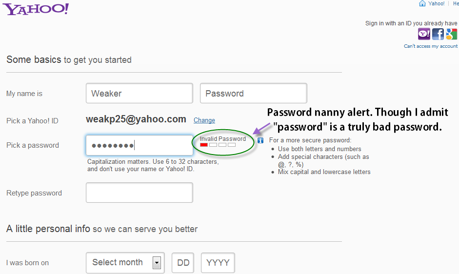
Yahoo uses an interesting system (see the screenshots below). They mostly tell people whether a password is weak, medium or strong. However, they do have specific words which cannot be used for passwords (such as “password,” which is what I used in order to get the forbidden screen although for some reason the notification that this word cannot be used disappears when I try to take a screen shot).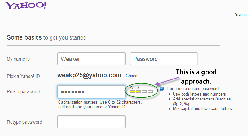
Don’t Ask for Information You Don’t Need
This is one of the most common mistakes people make and it often leads to form abandonment issues – asking for irrelevant information. I have even seen people who suggest that you don’t ask for a name, just an e-mail address in order to maximize the number of people who sign up for your service. I don’t agree with that approach. I think a name is important for personalization.
However, there is no reason that you need to demand my home address when you have me signing up to be a member of your blog. There’s no reason that I should be asked which colors I like when I sign up to read a newspaper and there’s no reason that I should be asked for my marital status when I sign up to buy a book at an online bookstore (single but in a committed relationship by the way – sorry ladies).
Now I do understand the urge to ask for this information. The more information you have on any given person, the more valuable they are as a potential customer. If you have a home address, you can send out mailers, you can also tailor information specifically to them based on where they live. However, if you want that information, you need to justify your request.
It is possible to do that in a way that doesn’t sound invasive by the way. For example, if you are looking for a home address, you can make your “free gift” something that is mailed to them. This allows several advantages. First, you can charge a bit for shipping and handling meaning that you eliminate the freebie seekers. Plus, people tend to place more value on a free physical gift than they do on an e-book or free software.
You can even ask questions about marital status, favorite color and all kinds of other things if you can find a way to justify legitimately asking for it. For example, you might be running a membership site and asking for marital status with an explanation posted explaining that you wanted to know in order to allow the significant other to gain free access.
Birthdays can be asked for if you tell people you send out a birthday present of some kind (for example, Baskin Robins has my birthday on file because they promised me a free scoop for my special day – I don’t use it anymore though since ice cream is bad for my health but the principle is still nice and I give away the coupon to a kid in my family when I get it these days).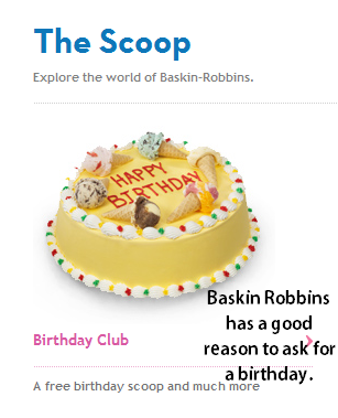
The bottom line though is that if you want additional information, you need to “pay” for it by justifying your reason for asking for that information. If you don’t justify it, you will find many people abandoning the forms or simply providing false information just so they can get through the thing that much faster.
Don’t Be Such a Stickler
This is another pet peeve of mine and it’s one that’s so easy to fix. Maybe you need to request a phone number or a credit card number or even a social security number on your form. Whatever it is that you need to ask for, it’s important to ensure that you get the formatting right because your system will need it formatted a certain way to make sense of it.
Thus it’s a big problem if one person writes a phone number as 555-555-5555 and another writes (555)555-5555 and yet another wants to format it as 5555555555. I get it – however that is you problem and not your customer’s problem. They don’t need to figure out how you like a phone number formatted.
Instead, what you should do is to either set up the fields separately so that the area code, exchange and number all get listed separately and then combined on your database or set up something intelligent enough to figure out how the numbers should be separated. At the bare minimum though, at least let me know that the formatting is off before I click “submit.”
Speaking of “Submit”
By the way, speaking of the word submit, take a look in a dictionary sometime and check out the definition. You can see a screenshot of what Google says it is (based on the Free dictionary) below. Is this really what you are asking your customers to do? Seriously? Go ahead and change that “submit” thing to something a bit more innocuous so that it doesn’t sound so demanding. Maybe “Give me my free stuff” or at the very least “Send.”
Pay attention to the words you use in order to ensure that your customers don’t feel as if they are being given ultimatums or something when they come to visit your site.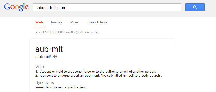
Let Me Know You Got My Information
Finally, every now and then, I fill out an online form, send it in and then watch as the site takes me back to the original form but in blank format. Sometimes, it takes me to the site’s homepage without any notification that the form was successfully sent to you. Why on earth would you do that? Have a success page for goodness sakes. Let me know that I didn’t waste my time filling out a form only to have it disappear into cyberspace because of a glitch.
Form building to me is just a pain in the rear, I hate the ones that are on a colored background too so I agree very much with that tip. Sometimes the computer has a mind of it’s own as well and you end up with your lines or boxes in the wrong place, it looked good while you were creating it but then when you post it, it changes the layout, why is that?
I honestly don’t know. I think it may have something to do with how certain web browsers read your content.
I love the password nanny thing, I hate when ever I want to fill out a form for something I have to have a sign in and password in order to do it. In cases like that I understand when it is a security thing and when it is just so they can bother you later through spam. I hate all the passwords though and the things that we are forced to remember.
Yeah, it’s really sad. Plus, because so many people use the same password across different sites, the request for passwords from unimportant sites can be really worrisome.