
What Color Scheme Should You Choose for Your Business Website?
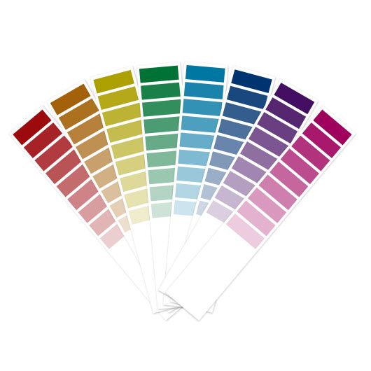 One of your most important decisions as a website owner is going to be choosing the color scheme of your website. It should reflect the seriousness or lightheartedness of your site and should be easy on the eyes. Sadly, some people seem to forget this when designing a website and then end up creating some so garish looking that it’s impossible to actually use the site for anything, even if the site happens to have useful information.
What Do You Mean By Bad Color Scheme?
A bad color scheme can take many different forms. For example, this site has a fine color scheme for the foreground, well mostly just black, but it’s at least uniform. However, that crazy background is giving me a terrible headache. Here’s another example which better illustrates the issue of color. Besides the fact that the background is painful to look at, it also washes out the words and makes it hard to see what the site actually says.
And just for fun, here’s an example of a horrible website which was designed to be horrible. In this case though, it’s more annoying than anything else. I actually think the two examples above are better, though they may change as these site owners find out that they’re being cited as examples of terrible site design.
Decide What the Theme of Your Site Is Going to Be
The single most important thing when picking a design as far as color is concerned is to think about the kind of audience you want to appeal to. For example, when I created my personal finance blog, I didn’t change the colors of the theme that it uses, but I did deliberately choose a theme which conveyed conservatism and financial responsibility. I wanted to come across as a serious news site and not as some kind of cheesy look-at-me- I-know-nothing-about-personal- finance-but-I-want-to sell-you-stuff-you- don’t-need-website.
On the other hand, if you are trying to appeal to a young audience who wants to feel light hearted about life, then you may want a completely different color scheme which reflects this. Here’s a good example – while I find the site design a bit cluttered, the color scheme is clearly showing you this is a fun site designed with kids in mind.
How to Choose
I find that if you are using a pre-made site design or a ready-made theme for WordPress, especially one which is popular and used by lots of websites, you don’t really need to tweak it much. The theme on my personal finance blog above for example is Mystique, which is highly customizable, including changing the color scheme, but I find that the basic design just works well and is clean.
Tool s to Help
On the other hand, if you’re not sure which color scheme to use or if you are designing a site completely from scratch, there are a few tools you can use to help you choose the right colors.
Color Palette Generator
This useful little tool will let you choose which color scheme is most appropriate to go with a photo. This means that if you have a great photo which you know you want to incorporate into your site, you can use this tool to match your site to the photo.
Colorzilla
A very useful Firefox plugin which will help you to choose the right combination of colors by providing good information on contrast and even providing you with useful pre-selected color schemes that work.
Kuler
Finally, a free tool from Adobe (who makes the Creative Suite CS5.5, which professional web designers use to make quality websites and graphics) allows you to generate color schemes that work and to ask others for their opinions as well.
Very informative post thank you so much for all the tips and tools you provided .. i specially liked the Colozilla one
Yeah, too often people forget that color makes a big difference in how their website is perceived.