
7 Important Tweaks You Can Make to Improve Conversions

Website design is really an important and overlooked area of online marketing. Most people tend to make something that looks nice to them or they decide to pay a professional to design their sites and advertising, simply hoping for the best. However, there are some tweaks that research has uncovered which can dramatically improve the responses you get from your customers. Here’s what you need to know:
Heat Maps and Eye Tracking
This post is based on research I found on a number of other websites which were the results of extensive testing using eye tracking technology (i.e. they set up sites which they paid people to look at and they actually were able to track where the eyes looked) and heat map technology (in this case, it tracks where the mouse cursor tends to rest).
Both of these technologies are an excellent way to ensure that you are gaining the maximum input from your existing customers so that they will make more purchases and pay more attention to the things that are important to you.
The Eyes Have It
Okay, I’m being a bit whimsical here but have you noticed how a great many websites tend to make use of stock photography which includes models in the advertising? These photos were rarely shot specifically for the use of the company who is using them. Instead, they purchase the right to use the photos from a service which arranges for professional photo shoots.
You can even find many such photos on free photo services though I tend to shy away from them because I cannot guarantee that they actually have a model release. Anyway, the bottom line here is that many, many people are using these stock photos of people incorrectly.
The results of extensive testing show that people tend to look where eyes on the models are looking. In essence, if the model is looking directly at them, the person who is looking at the ad will tend to look directly back at the model (kind of odd since so many people have trouble looking someone straight in the eye in real life).
However, if the model is looking at the product being advertised, then the people viewing the ad will tend to glance at the product they’re looking at, which is after all what you want them to do. I think it’s probably the same sort of thing as we see when looking at someone in person. We tend to glance at whatever someone else is glancing at which is why when one person starts looking somewhere, others tend to follow along.

Notice that the model’s eyes are looking to the right where the product is located rather than looking straight at you.
Video and Photos are Big
Much as I hate to admit it since I make my living as a professional writer, people tend to look much more closely at video and photos than they do at text. What’s really odd though is that this works even for very basic videos, like the kind where small bits of text are set against a background where someone reads it or against music.
This is likely a result of the kind of media saturation that we all live with today. I mean, the art of reading a book has become more and more blasé as people have continued to look at movies and TV shows. I’ve always said that sound bites are the death of intelligence and they are – people can’t be well informed about a subject in 30 seconds.
That having been said, you still need well written text to surround your video and photographic content. If you just have photos or video without any text to explain things, people often start to look elsewhere. It’s also useful to note that the super long videos which don’t allow you to move on and make a purchase are not always effective.
In general, most people will sit through a couple of minutes of video but will want to see a buy option or even just text to skim through after that. If you think that a half hour video is going to be watched all the way through before you show a buy button or anything other than text, you’re likely to be disappointed.
Most people simply don’t have such a long attention span (again, think about how long a typical news broadcast is and make your videos work accordingly – there’s a reason most news reports are about 30-60 seconds long).
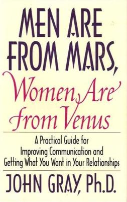
Men are From Mars, Women are From Venus
This is the title of an old book on how men and women can relate to each other. It suggests that men and women fundamentally think differently from each other. A classic example is that men tend to be fixers (i.e. you have a problem, let me suggest a way to fix it) as opposed to women, who more often than not simply want to commiserate rather than fix the problem.
The same axiom applies when selling products though. It should come as no surprise that knowing who your potential audience is makes a massive difference in the number of products that you’re likely to sell. If for example you sell products which are primarily aimed at women and you use a female underwear model to sell the product, you’re less likely to make sales than if you were to use a different kind of model (unless of course you were selling lingerie in which case, carry on).
However, even when selling less obvious products, you need to keep this in mind because the women will tend to focus on a different section of the page than the men will. Men tend to be drawn to the areas that appear “sexy” whereas women are more likely to look at the practical things. I don’t mean to sound sexist here at all by the way. This is just a fact of how men and women think.
Make It Symmetrical
People’s eyes tend to move from top to bottom when they’re looking over an ad. This means that if you want to keep people’s interest in your products, your best bet is to make things symmetrical. This means that you need to have your model holding the product below their face and then the name below that. It shouldn’t look awkward but it should ideally be symmetrical with easy to follow lines.
Along those same lines is the KISS principle which I always talk about here – Keep it Simple, Stupid. You need to keep your copy and your design simple. If people can’t figure out where their eyes are meant to go, they’ll often just leave your site and go elsewhere. It’s easy enough to figure out how to make this work – if ten people you ask to look at your site can’t seem to figure out what to look at and click on, you have a problem.
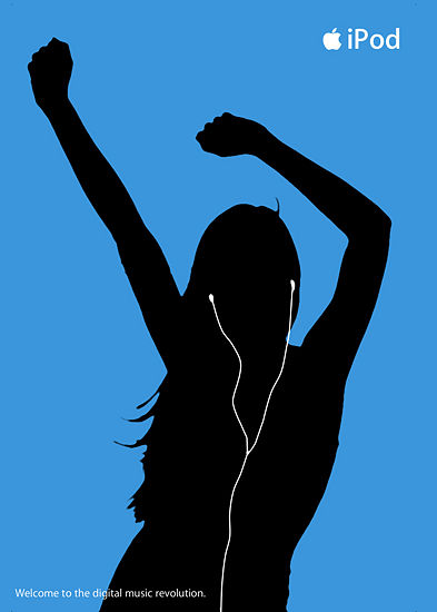
Why does this iPod ad work so well? It’s symmetrical, with clean lines and it’s also simple, giving people a clear idea where to focus their eyes.
Most People are Leftists
Okay, not really. If the polls in the USA are right, people tend to split more or less down the middle between left and right. However, one thing that every single study has found is that people tend to look at the left side of a website first. This means that your advertising and most important material needs to be there rather than on the right side.
The irony is that for some reason WordPress (which is the most popular content management system) seems to insist on keeping the ads in the right side of the page. At least, that has been my general impression of most WordPress based sites. Fortunately, it’s pretty easy to arrange to move your sidebar ads to the left within WordPress. Most themes let you do it without too much trouble.
You should however put less important things such as menus for your blog along the top or along the right side of the website in order to make sure that these things are not taking up the most valuable real estate. One exception by the way may be if you work in a language which is written from right to left (i.e. Hebrew or Arabic). In those cases, you’re most likely to see your best results putting important stuff on the right.
Hand Written Messages Add a Personal Touch
This is another one of those things that seem obvious but that too many people ignore. Handwriting style fonts often help to sell products. I’m not sure why that is, especially since these fonts are obviously just computer generated fonts which don’t seem to offer anything different but they have a visual appeal which people like.
That’s actually why you often see circles that look handwritten on professional squeeze pages and you also tend to see a lot of content written in handwriting. The most effective way to do this though is to actually have some text in regular fonts and “notes” pointing things out in a handwriting font.
This isn’t difficult to do using a program like Photoshop but many people don’t do it, either because they simply don’t realize how powerful this is or because they don’t know how easy it is to actually do the whole handwriting thing. You can easily add extra fonts to Photoshop and there are enough free handwriting style fonts that there’s no excuse not to do this.
Notice the hand written note and hand written style circle.
By the way, on the same vein as this, you also definitely should consider putting in a photograph or yourself along with a signature. It needn’t be your real signature. A handwriting font signature will work fine. However, when people see this, it tends to give them a warm and fuzzy feeling as if they are buying from a real person rather than just a nameless, faceless corporation.
Money Back Guarantee
Okay this one is not strictly based on experiments using eye tracking or hot spots. It’s simply an observation that people tend to make purchases more often from sites offering an “iron clad” money back guarantee. The thing is, 98% of people will never actually take advantage of this money back guarantee at all. They simply want to know it’s there.
This is a matter of human psychology and I’ve written in this space in the past on this subject. People tend to notice if there’s a money back guarantee because we’re all afraid of getting stuck with a lemon of a product.
However, just as we’re all worried about being stuck with a lemon of a product, we also worry about not feeling foolish for having purchased a lemon to begin with. Thus there is this weird dichotomy going on where prior to purchase, we want the assurances that we can get our money back if it turns out this was not a good deal. However, once we’ve made a purchase, we tend to want to justify it and make ourselves feel good about the fact that we spent the money, making it very unlikely that we’ll take advantage of the money back guarantee.
The exception of course are the serial refunders, who will always do this in order to get the free stuff. However, you can easily identify these people and block them from future purchases of your products.
Obviously, not every product will lend itself to this model. Services for example generally shouldn’t be offered with no questions asked money back guarantees because the service has been performed and you can’t “restock” your time for having performed the service. However, in most cases, you can safely add a money back guarantee and know that it will increase sales without costing much in terms of refunds.